Saturday 19 November 2016

JCDecaux

JCDecaux is the UK’s largest Out-of-Home advertising company, engaging consumers anywhere from airports to a TV advert. They effectively use different media to reach multiple target audiences. One of their offices in London is somewhere I would always pass unaware of what or how big this company actually is.


The company was founded in 1964 in Lyon, France by Jean-Claude Decaux and over the years has expanded massively in several countries. Its headquarters is located in Neuilly-sur-Seine, a suburb of Paris, France.

It currently operates in 70 countries and 165 airports, across 5 continents - 77.9% of JCDecaux’s annual revenue comes from abroad.

www.jcdecaux.co.uk/

Friday 11 November 2016

TRUMP WORRIES

The backlash Trump got against him in America is also widely present in Europe. In their recent cover, the German weekly news magazine portrays the U.S. president elect as a menace due to their worries about unity. In this type of propaganda poster the title beneath translates to "it's the end of the world (as we know it)."


European Union worried about Trump presidency article

SIGN FROM MEXICO (P)


Bathroom sign from Cancun, Mexico I took while on my trip there. This appealed to me because of the humour it features with the image and play on the type with the 'o' as a toilet seat. This gives insight into different cultures perception and willingness to play on things that can normally be seen as repetitive and boring.

Wednesday 2 November 2016

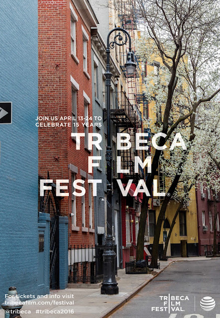
TRIBECA FILM FESTIVAL


Created by J. Walter Thompson, these posters effectively capture New York City from using its architecture of the most iconic sites. Shown are some of the posters made for Tribeca Film Enterprises dba Tribeca Film Festival. The Project Name: Tribeca Film Festival 15th Anniversary campaign and Tribeca ReActor.


With his poster the background/setting of it captures New York amazingly however the lamp behind the 'C' I would of removed.


J. Walter Thompson

https://www.jwt.com/

J. Walter Thompson is an international marketing communications advertising agency headquartered in New York. It expanded to more than 200 offices in over 90 countries becoming the first American agency to expand internationally with the opening of J. Walter Thompson London in 1899 and from there such as in Egypt, South Africa and Asia. It was also the first agency to provide a wide range of advertising services to clients, including, copy, layout, package design, trademark development and rudimentary market research.
In 1864 J. Walter Thompson traces its origins to the Carlton & Smith agency where founder William James Carlton started selling advertising space in religious magazines.
In 1868, Carlton hired Thompson as a bookkeeper who eventually went on to find that soliciting and sales were much more profitable so he became a very effective salesman for the small company.
In 1877, Thompson bought the agency for only $500 and renamed it J. Walter Thompson Company.
Notable clients have included: Air Canada, Intel, Johnson & Johnson, Kellogg’s, Macy’s, NestlĂ©, Nokia/Microsoft Mobile, Nike, Rolex, Royal Caribbean, Tim Hortons, Toys R Us, Volvo Cars.

Friday 28 October 2016

ANONYMOUS

This JR street art piece featured on the pedestrianised Flatiron Plaza next to Madison Square Park in New York, photographed from a helicopter for a full view. The pedestrians walking over it are not even aware of it, the size of it and the many distractions around the busy city leaves people so unaware of their surroundings.

Elmar, Flatiron Plaza, New York, 2015
JR : “This was a project on anonymous immigrants who arrive every day in New York. All day long, people walked on this pasting without realising what it was – it was over 50 metres (160 feet) long. It was only when I photographed it from a helicopter and the image was published on the cover of The New York Times Magazine, that people noticed it; then the focus flipped – the guy in the photo, Elmar, a recent immigrant from Azerbaijan, was in the spotlight, and the pedestrians walking over it became the shadows.”

Wednesday 26 October 2016

360° BOOK

A twist on a pop-up book, illustrated by Yusuke Oono, looking at both art and architecture in this 360° book which allows the reader to get a panoramic, 3D view of Mt. Fuji.


Primarily an architect but also plays in fields including product design and art installation, Yusuke Oono first submitted the idea of a palm-sized book that opens up 360° back in 2012 - something that had not been seen before.
Despite set backs for it to be put to market, working with other companies help to produce it for sale.
The 360° book has two stories available: Mount Fuji and Snow White!


Thursday 20 October 2016

RECYCLE

The Newspaper that becomes a plant.


In Japan, one of the most famous daily newspapers there invented a one hundred percent sustainable newspaper, invented by the publisher of the famous Japanese daily, The Mainichi Shimbunsha. Called the 'Green Newspaper', it is not the first sustainable initiative by the Japanese daily.


The idea was conceived by Dentsu Inc, one of Japan’s largest advertising agencies. By a mixture of recycled paper, water and small flowers or herb seeds when torn it into small pieces, planted and watered within a few weeks it will have made plants and flowers; although recycled paper is not a brand new thing.
 

The eco-friendly newspaper has had a huge success, a circulation of over four million copies a day across the country and revenues of about eighty million yen, equivalent to over $700,000. The initiative has also involved schools in order to raise children’s awareness on environmental issues and teach them the importance of recycling.


Wednesday 19 October 2016

ADS BY DRONE


In Mexico City, Uber is doing huge business that they feel comfortable enough to put ads on drones and have them taunt drivers that are stuck in traffic; as if being in a traffic jam weren't annoying enough.
This first attracted me because of the humour involved with it, but as a driver I can see both, positive and negatives, the sides of this ad strategy. Uber's idea for the use of drones is something not thought of before and is ideal for addressing their target audience.
This ad stunt for UberPOOL fly drones carrying signs saying things like "Driving by yourself?" and "This is why you can never see the volcanoes."
The whole point is to guilt the reader into taking an over but that won't get you anywhere fast, if anything, you might even be waiting a little bit longer. This is part of their expansion strategy / 'world domination'.


http://www.adweek.com/adfreak/uber-putting-ads-drones-and-having-them-taunt-drivers-stuck-traffic-174136

Tuesday 18 October 2016

'M'


The 'M' is the city of Manchester's brand logo and part of its identity. The colours represent the essence and diversity of the city and the individuals within it, expressing the city as a truly exciting place. The people, original style and modern make Manchester what it is.
It is used for national and international communications, when partners are promoting themselves jointly under a 'Manchester' banner. This shows how the city has mass amounts of worldwide and nationwide connections that they work strongly together with.


Sunday 16 October 2016

OLD SCHOOL TRAVEL POSTERS

Comparing old style advertising with new advertising, the world has come a far way. You can grasp some history from the times the posters were made. The images show the old style uses more block typography and illustration along with more of a straight forward direct message. Today, in the time of digital and social media, we see more TV ads showing what they think people want to see of the places and it's all about being competitive so having cheapest price for it.


Really showing its age, this poster was part of a collect in the early part of the 20th century when the countries official name was Dutch East Indies (countries included now within Southeast Asia such as Indonesia) and under Dutch colonial regime.


Formally, when 'Russia' was the USSR, which dissolved in 1991, this ad shows parts of history and just how the USSR was known for hunting back then - this would have attracted many as it was more common


https://www.buzzfeed.com/samjparker/travel-posters-old-ads?utm_term=.kjjDANl0w#.bhK7p0NWQ

Friday 14 October 2016

PATTERNS IN MANCHESTER

Patterns can be found anywhere from stones on the floor, creating a patterned path... 

 
... to wall tiles in the MMA.


Even the architecture has a distinct pattern in them - the windows, engravings and colours - all from the past when they were built with unity in mind. The designs of buildings, old and new, keeping the distinct features give Manchester part of its identity.


The honeycomb pattern behind the busy bee found all around Manchester is considered the symbol for the town and represents its industrial past. As well as spotting the Manchester bee around town there was a sign that was repetitive, 'Post no Bills'. This phrase generally means don't put any signs up here and cities like Manchester including New York have them all over.


Prints, graphic designs and posters - this one in particular shows a distinctive geometric pattern from a street poster.


Wednesday 12 October 2016

CREATIVE MINTS

Illustration & Digital Art


Artwork from one man, Mike, design studio Creative Mints. Creative Mints are a boutique human-centred design agency from Prague, specializing in branding, ui and illustration.

The website showcases many types of design works Creative Mints have done, including characters, games, graphic design, ui (user interface design) and web. All process shots of their sketches and various concepts are displayed giving you a real understanding of just sketches to real life product.

Some of his 'character' work:

Dwunn - Concept art and character design


 I'm more drawn to some of his 'graphic design' work:

"Edge" Playing Cards


Saturday 8 October 2016

LIBRARY

ARCHITECTURE

The stunning white and gold themed architecture caught my eye immediately. The images depicts Admont Abbey Library in Austria - the largest monastery library in the world.


The 70m library was built in 1776 by architect Joesph Hueber with sculptures made by sculptor Josef Stammel. The ceiling features frescoes, wooden sculptures and gold busts showing the stages of human knowledge with light coming through 48 windows.
The library collection involves some 200,00 volumes, more than 1,400 treasured manuscripts (earliest from the 8th century) and 530 incunabula (early printed books before 1500).

Thursday 6 October 2016

AUDI


Audi's 'Speed Isn't Everything' advert shows a slow motion shot of an orange Audi in a dimly lit underground car park; spinning in a perfect circle at the end to make up one of Audi's interlinked rings logo.

This tv advert caught my attention every time it was played, however the ad has been banned now because of one complaint. The video is designed to show speed isn't everything, Audi Sport's technology shows control. The difference between this and all other car adverts that don't really focus that much on the car, whereas Audi have spotlighted their car and nothing else around.


Creative agency Bartle Bogle Hegarty Creative team Ian Heartfield, Vinny Olimpio Client Sarah Cox Production company Rogue Productions Director Mark Jenkinson
Read more at http://www.campaignlive.co.uk/article/thinkboxes-awards-tv-ad-creativity-shortlist-may-june/1402293#sU13CyrQGp3IWFhP.99

You can watch the AD here:
https://www.youtube.com/watch?v=9Yzffwe2Nzo

Sunday 2 October 2016

REBRANDING

Visual Identity
Old logo

The popular food delivery company Deliveroo has re-imagined their logo from a kangaroo with a food bag everyone identified with to a different, more minimal, design people now should get familiar with.
Along with many other brands that are redesigning their logo Deliveroo revealed their new logo and visual identity created by Design Studio - the same agency that rebranded Airbnb and Premier League.


Other redesigns of logos

This new symbol for their logo is now featured on their app, website and also inspired the design of colourful jackets and jerseys for riders.
The whole process from picking Design Studio for branding where they went the extra mile in understanding the brand first. They became riders and did service shifts to get a feel for what Deliveroo really meant. Design Studio then carried out a full semiotic analysis, looking at what the logo meant in other cultures and countries. The kangaroo was a firm part of their identity now that people identified with.

New logo

https://www.creativereview.co.uk/deliveroorebrand/